My Role
UX Strategy: Analyzing conversion
UX Design: Solving funnel issues
Project Context
10 Weeks: Fall 2021
Team: 1 UX Researcher, 1 UI Designer, 2 UX Designers, Engineering Team
Company: EdCuration - makes the process of buying and selling education products and services streamlined
The Challenge
Vendors weren't converting to paid users
Vendors weren’t seeing the leads they were expecting on EdCuration. This deterred vendors from upgrading from the free vendor subscription, which is how EdCuration makes their profit.
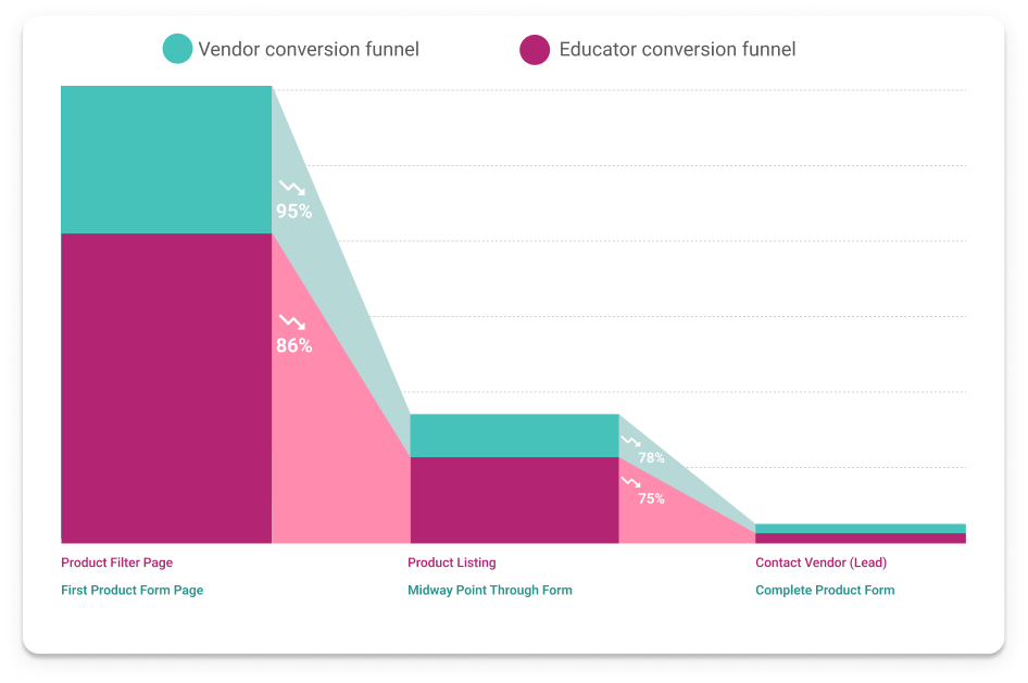
Looking at the conversion funnels
01 Vendors are abandoning the form
We looked at the conversion funnel. We found that although many vendors were coming to the site, there was too much friction when vendors tried to post their listings, leading to vendors abandoning the product form altogether. We validated this was indeed the case using analytics.
02 Educators are abandoning the search for products
We looked at another conversion funnel. We found there was too much friction when educators tried to search for products and search for key information on the product listings, leading educators to abandon the search for products altogether. Ultimately, this stems from the fact that the vendors are not filling out their product form, which is where that information populates from.
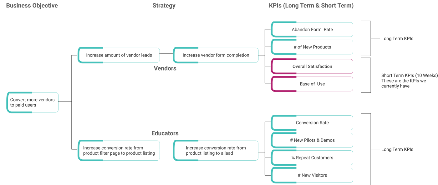
KPI Tree
Aligning on success metrics
Requirements Gathering
Our 3 stakeholders with different needs
Business
- Limited budget for usability tests
- Must use their existing brand guide
- Encourage vendors to fill out their product form
- Gameify the vendor form
- Some questions on the form cannot be changed
- Best highlight vendor’s products and services
Educators
- Vendor product listings need to have key information for decision makers
- Filter products effectively
- Use language educators will understand
- Key information should be easy to find
Vendor
- Flexibility to accomodate unique products
- Need more leads to stay or sign up with EdCuration
- Passive marketing for products and services
- Communication between educators and vendors is important
- Use language vendors understand
01 Hypothesis
01 Why do vendors abandon the form?
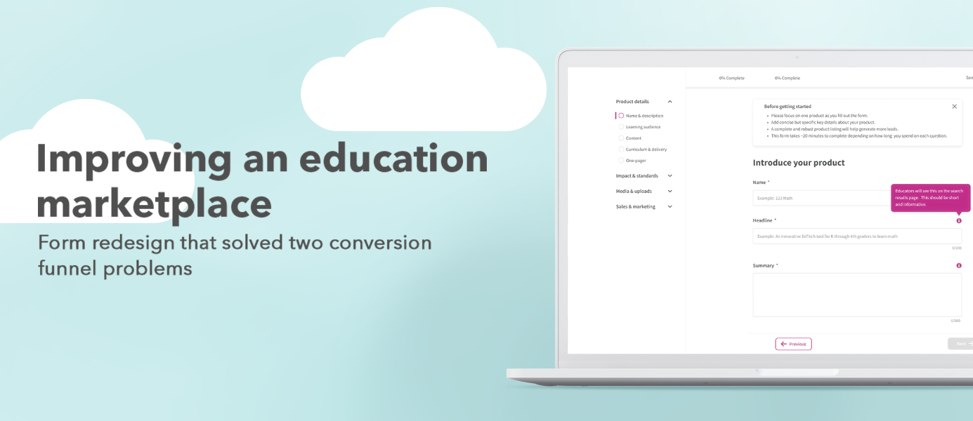
User interviews and usability tests of the existing form uncovered issues that suggested the form was too hard too fill out.

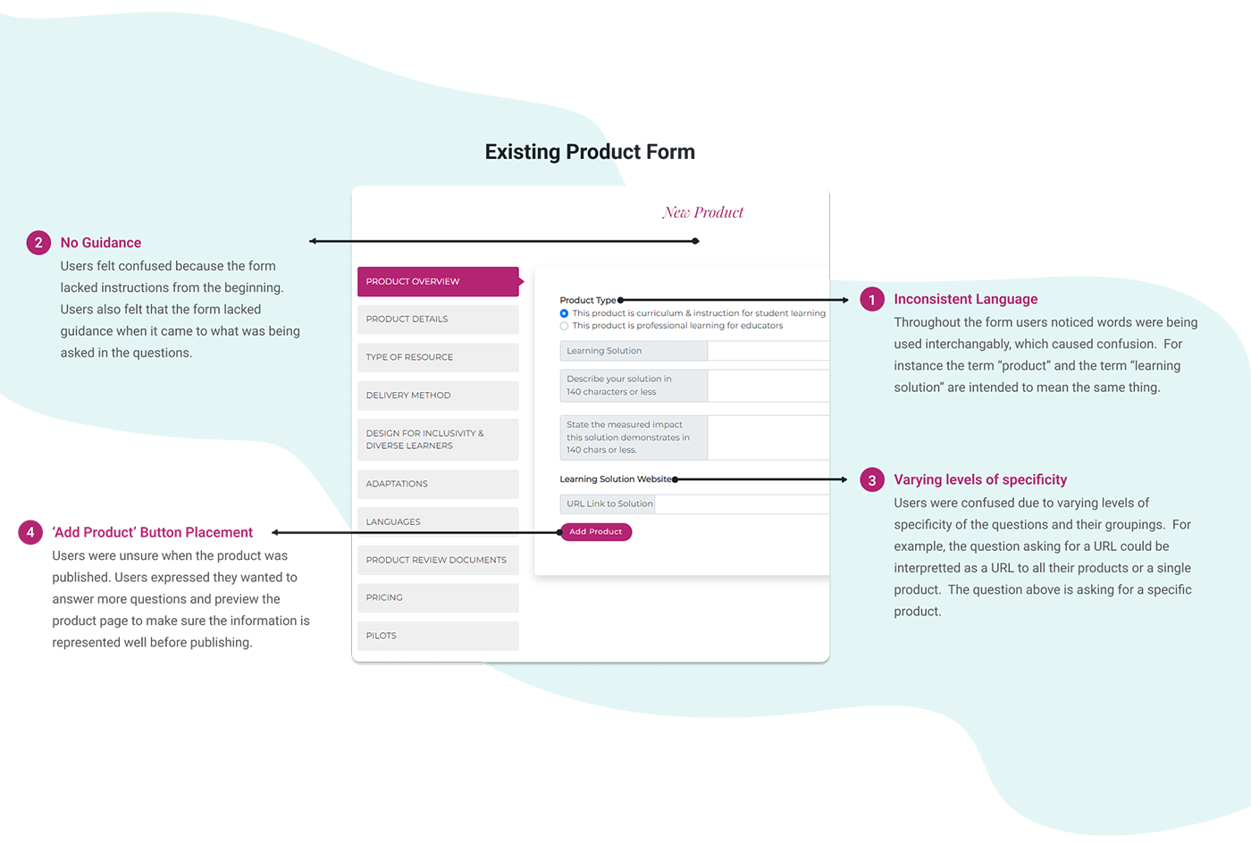
Inconsistent language
The form used different words for the same concept interchangibly.

No Guidance
The form lacked guidance for the users on how to best fill out each question.

Varying levels of specificity
Varying levels of specificity made it hard for users to define their product and answer questions adequately.

‘Add Product’ button placement
Users were unhappy with the add product button placed on the first page of the form.
Initial Solution
Solving problem 1: form abandonment
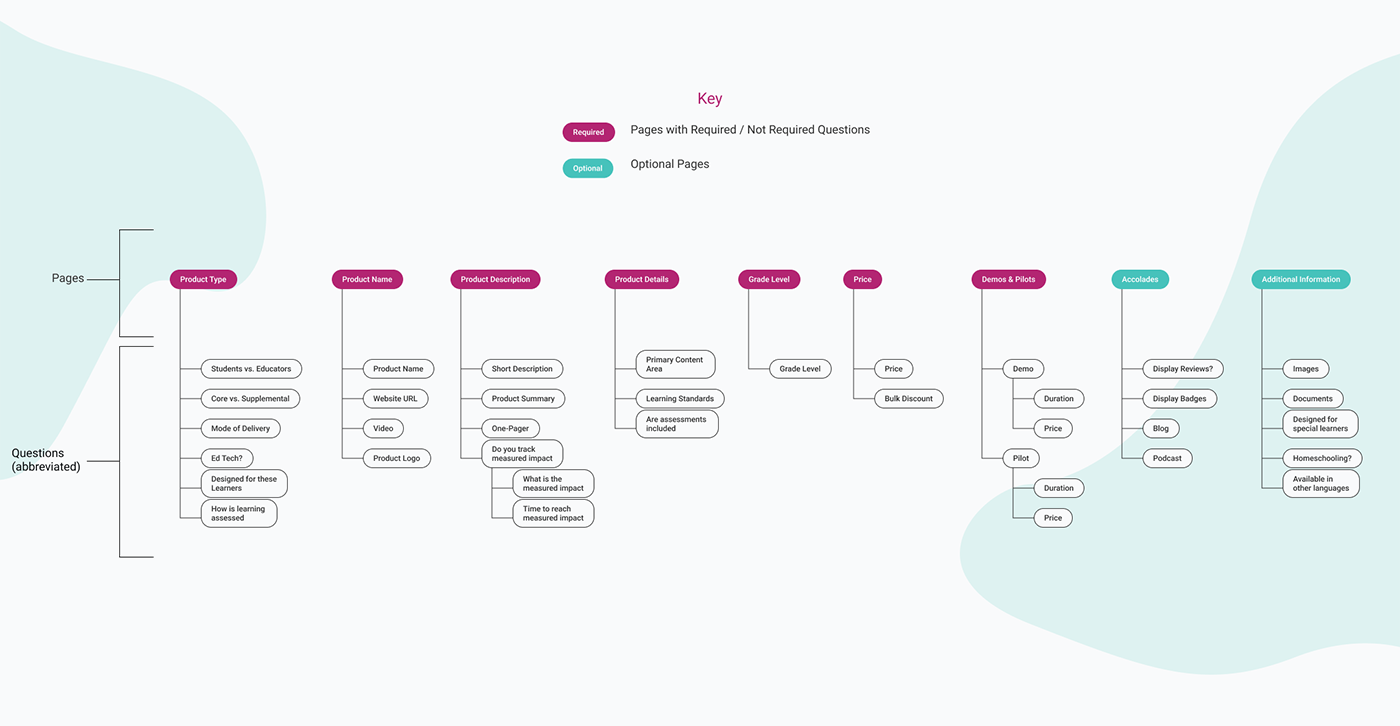
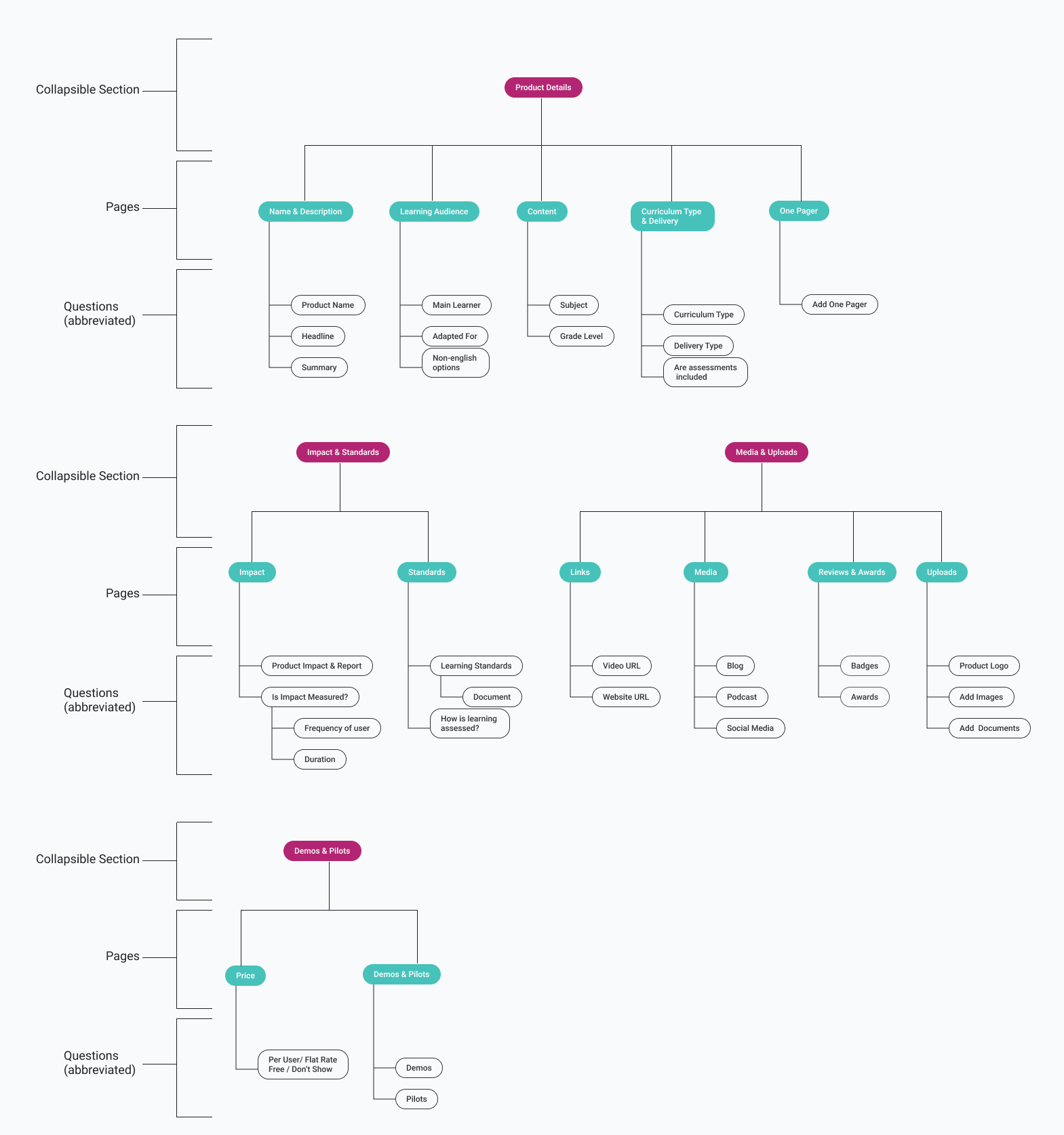
Improving the IA
We clumped the questions together based on four things:
- Required/ not required questions - Under the assumption that the vendors would not want to fill out all of the questions on the form, we put all of the required questions at the beginning pages.
- Specificity of the question To help lessen confusion, we grouped questions that were of the same specificity.
- Importance to educators To help make sure the vendors are putting out the information educators want to see.
- Related questions togetherTo put the questions into the most logical groupings along with all of the other considerations taken into account.
Making the form even easier to fill out
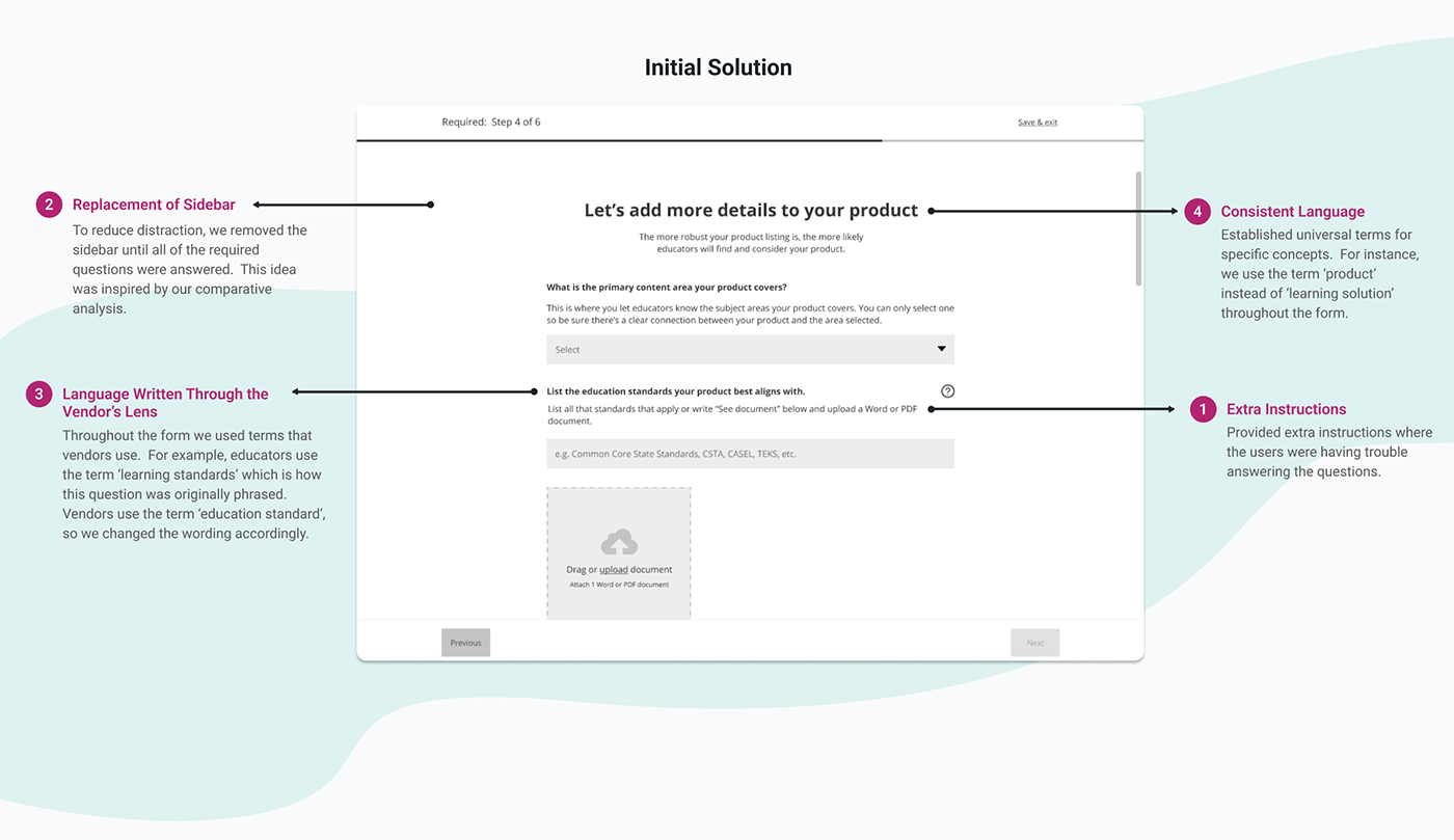
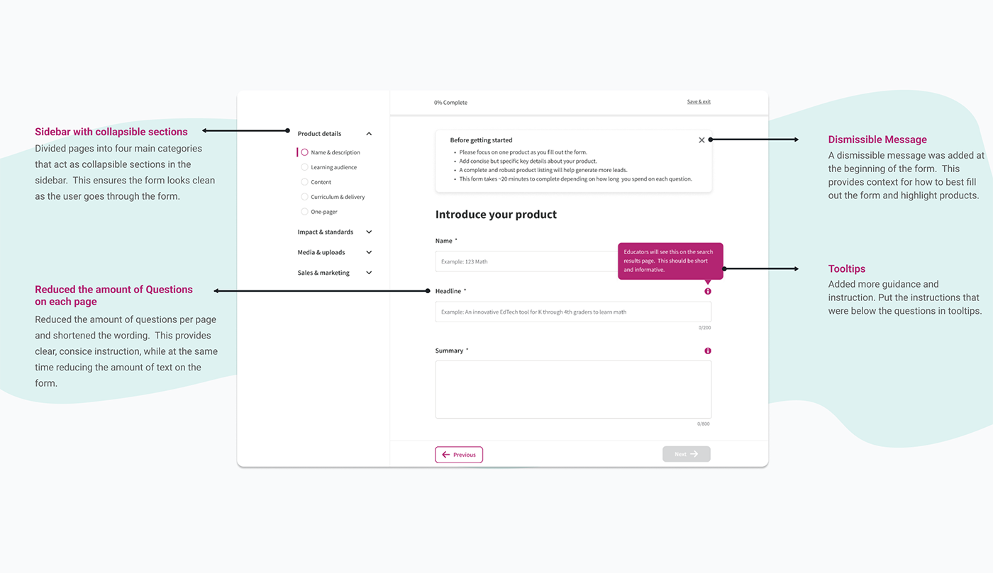
Extra Instructions
Provided extra instructions under difficult questions.
Minimize distraction
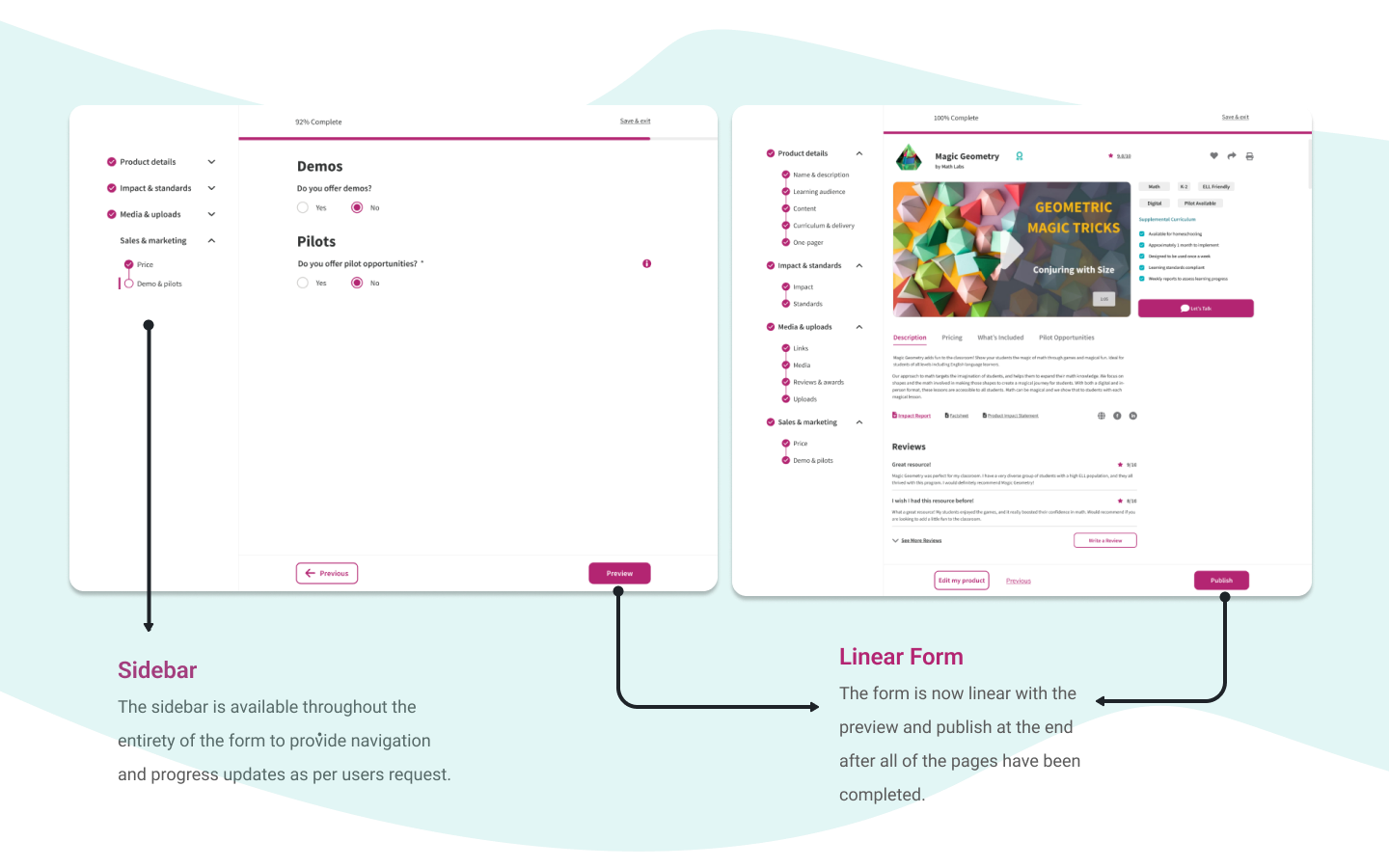
Took away the sidebar until all of the required questions were filled out to minimize discraction.

Language through the vendor’s lens
Changed the language to be more through the lens of a vendor and less through the lens of an educator.

Consistent language
Kept the language consistent and revelant.
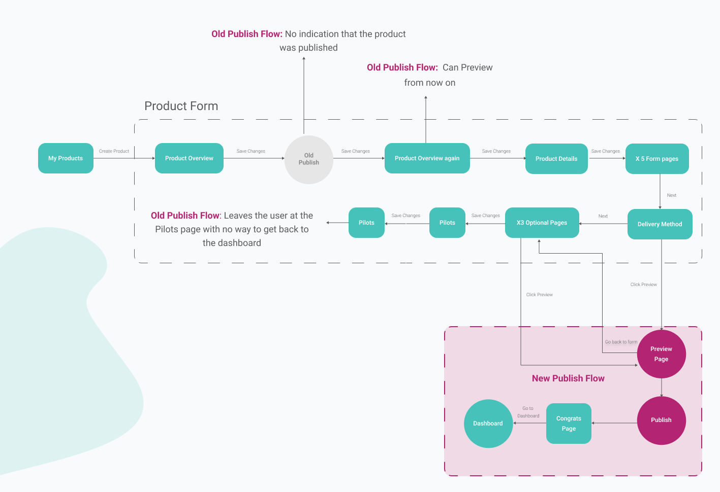
Providing system feedback and improved the preview publish flow
Preview and publish
Once all of the required questions were answered, a sidebar popped out that had a the ‘Preview’ and ‘Publish’ button.
Providing system feedback
Once they published their product, the vendor would be prompted with a ‘Congratulations, your product is published’ page.
‘Next’ Button
The old form did not have a ‘next’ button. To get to the next page you had to hit ‘Save Changes’ and scroll up to the tabs and click on the next tab. The new form had ‘Next’ button that saved and went to the next page.
Final Solution
Validating our new solution
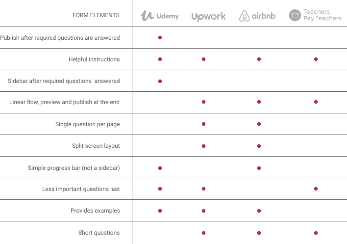
Comparative Analysis
One assumption was wrong: The form wasn’t too long
It turns out that vendors wanted to go through the entire form, thouroughly, and fill out as many questions as they could to best highlight their product.
Based on this finding we analyzed four indirect competitors and found that most forms have a linear flow where preview and publish are at the end of the form. This was an influencing factor in our next iteration of the flow for the preview and publish button.
Even more guidance
Findings
Users complained about too much text on certain pages, yet at the same time users still wanted more in the form of helper text and guidance.
Improvements
We decided to put the helper text in tooltips, dismissible messages, and limited 3 questions per page. This improved the pages themselves, but inadvertently created more pages. Having more pages caused the sidebar to look busy and overwhelming. To make the sidebar look cleaner, we organized the pages into 4 main categories that acted as collapsible sections.
Improved the groupings
Finding
Vendors were still confused at the grouping of questions. Our assumption was that it was because we were prioritizing the questions based on the wrong considerations (e.g. required/not required, etc.).
Improvements
The users wanted to go through the entire form and answer as many questions as they could. It is because of this finding, that we do not have to consider required/not required or importance to educators because the vendors are answering those questions regardless of where they are in the form.
02 Hypothesis
Why do educators abandon the search for products?
I worked closely with the design team assigned to design the filter system and product listings themselves.
Together, we uncovered that the problem is:
The filter system doesn’t funnel products effectively
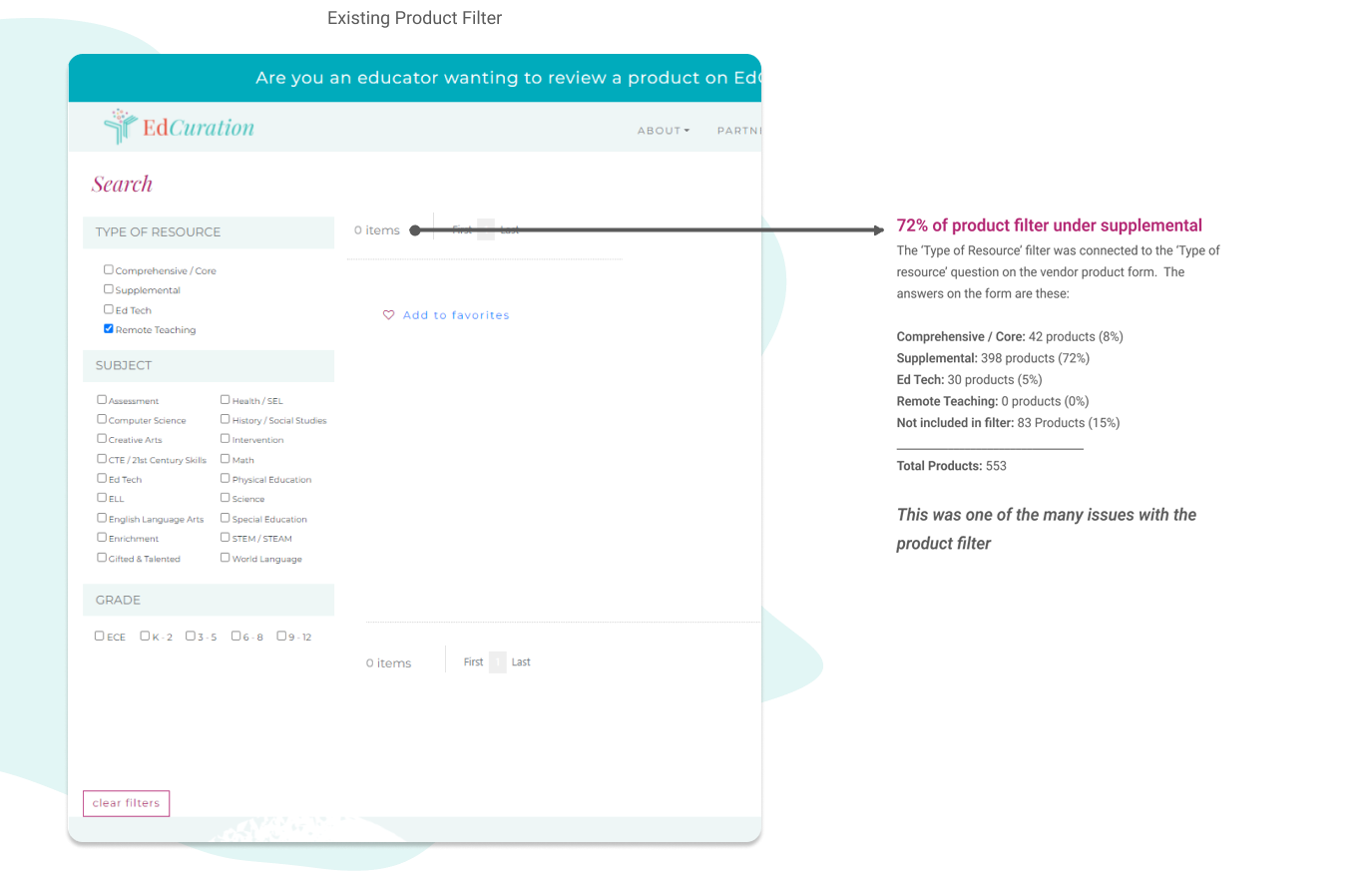
What does this have to do with vendors?
The vendor product form is where the product filter system takes the information from. During usability tests, we uncovered these three issues that were linked directly to the filter system.
.png)
.png)